Color Maps
What is a Color Map?
A color map is the spectrum of colors use to represent sequential data. The most common color map is 'jet' (shown below) which has one end of the spectrum being blue (e.g. having lower values) and the other end being red (e.g. high values).
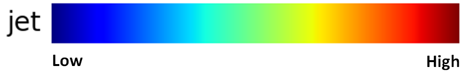
Tutorial 6 - Figure 12 - Color map of 'jet'
Why should I consider different Color Maps?
The difficulty with color maps is finding a uniform way to color data so that it not only looks good but also will still present data in the correct manner if printed in black and white or if someone that is color blind views the data. It is also beneficial in having the transition of the spectrum be from its darkest color to its lightest or vice versa. In the above 'jet' you can see that both ends of the spectrum are dark with lighter sections in middle which can result in confusion of what the data is showing, especially if the information is printed in black and white. Below is a gray scale of the jet color map. For these reasons tools such as Matlab have moved away from the 'jet' color map.
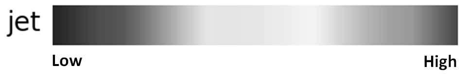
Tutorial 6 - Figure 13 - The 'jet' color map in a gray scale
This section won't dive further into the reasons behind how the different color maps were developed but a good resource is the Python MatPlotLib library. Their work was first published in 2015 on the development of new colors maps, you can read about it here, they also have a video of the 2015 presentation that is a good explanation of their design process. The research created several new color maps, the highest rated being Viridis, shown below.
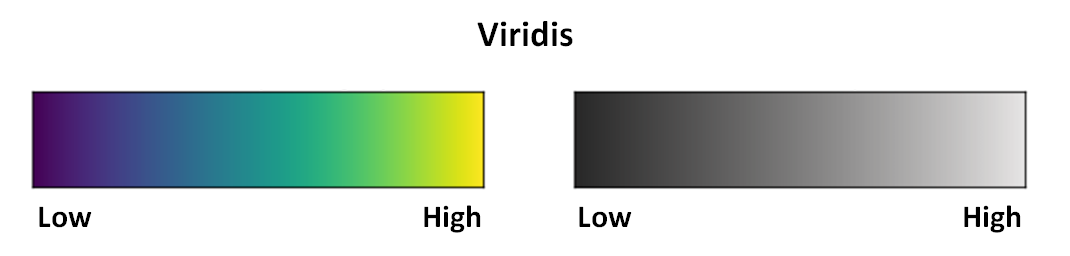
Tutorial 6 - Figure 14 - Viridis color map and corresponding gray scale developed by MatPlotLib
in:Flux Color Maps
The use of different color maps is beneficial but may come at a surprise to someone who see it for the first time. For this reason, 'jet' is still used as the default color map for in:Flux, but we highly recommend using Viridis, Inferno, or Parula.
There are 13 different color maps available to use on in:Flux projects. They can be found under the Appearance section of the visualization item's properties panel. In the Color Map section, choose one of the options in the Palette dropdown menu. 'Jet' will have already been selected. The below image shows the properties panel for the Streamwise Velocity Contour from Tutorial 1 and the available options for the color map.
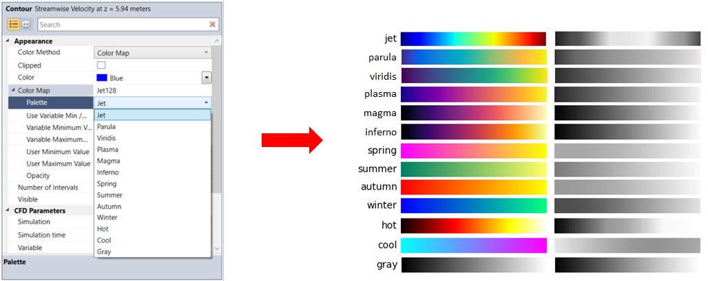
Tutorial 6 - Figure 15 - Indication of where to change the Color Map in the Properties Panel as well as a depiction of each color map available in in:Flux
For reference a top view of the Streamwise Velocity Contour is shown below first with the Jet color map and then with three of our preferred color maps. Feel free to explore the other options and use the one which you deem best for your project work.
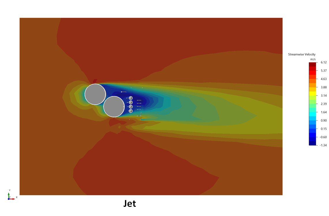
Tutorial 6 - Figure 16 - Streamwise velocity contour at 5.95m with 'Jet' color map
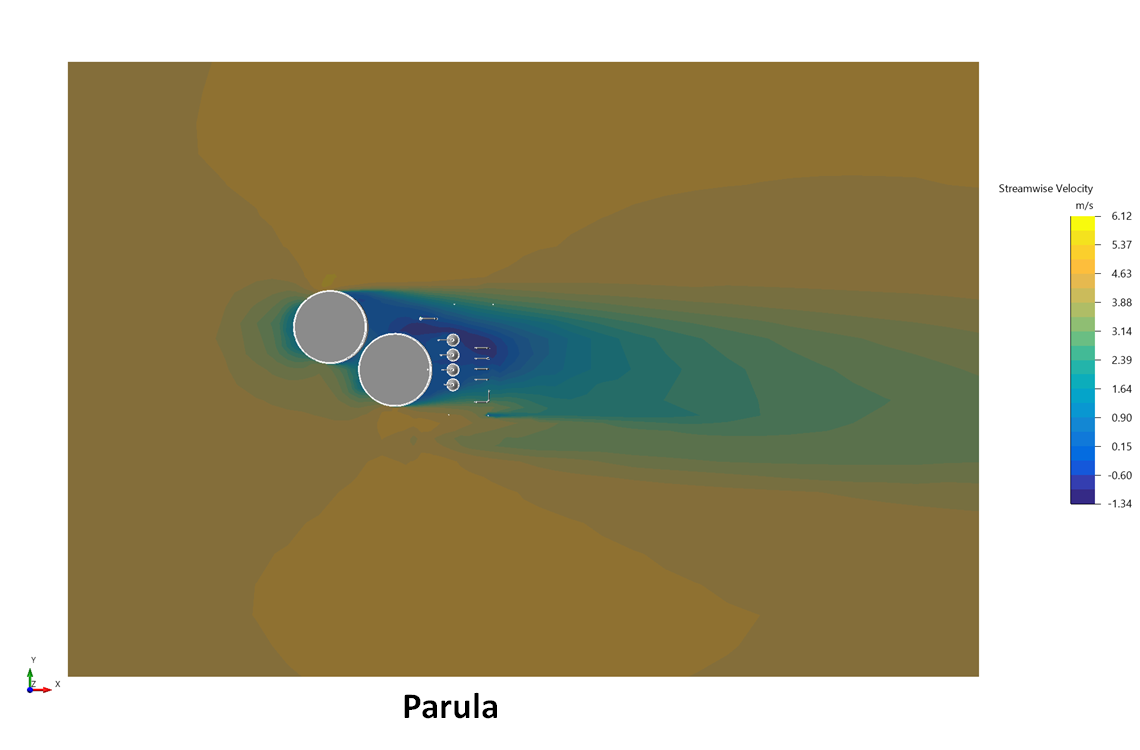
Tutorial 6 - Figure 17 - Streamwise velocity contour at 5.95m with 'Parula' color map
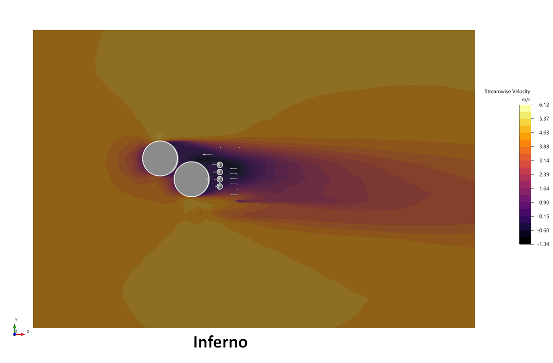
Tutorial 6 - Figure 18 - Streamwise velocity contour at 5.95m with 'Inferno' color map
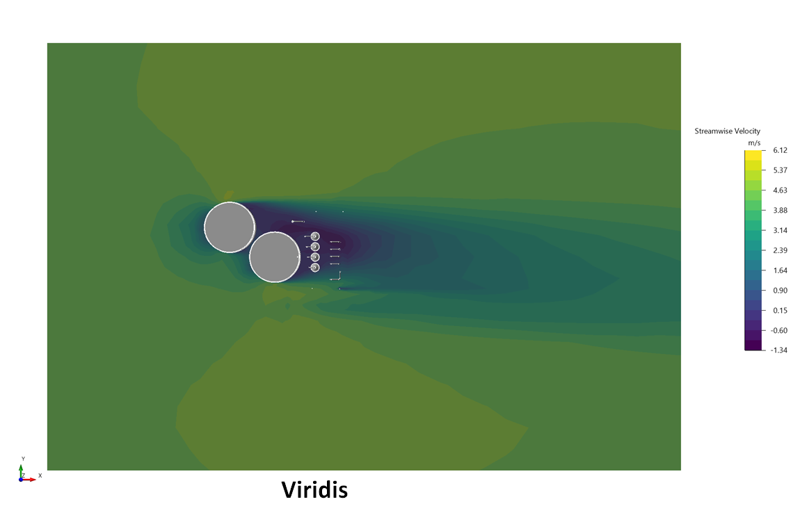
Tutorial 6 - Figure 19 - Streamwise velocity contour at 5.95m with 'Viridis' color map
Color Method: Color Map
The automatically chosen color method for contours, vectors, and streamlines is the Color Map and will be defaulted to the Jet Palette.
The color map chosen in the Palette option will be ignored when the other Color Methods (Constant and Default Color Map) are selected.